 The Boathouse
4 Subtle Rules for a Better Website or App
How to design experiences that inspire confidence.

A well-designed interface not only makes your product easier to use; it signals legitimacy and inspires trust. Here, I’ll outline four rules seasoned designers use to create excellent first impressions.
#1. Hierarchy
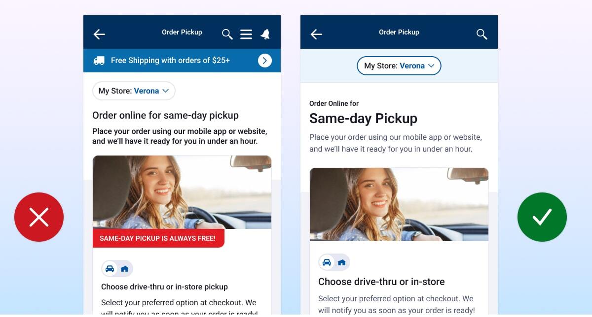
A staple of good design is hierarchy—the contrast between elements that tells a user what is most important.
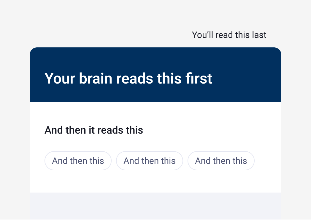
Basically the hierarchy says, ”Look at this first”. Clearly calling out the most important content (like headings and interactive elements) makes your content easier to scan, and helps to guide your user’s eye down the screen.
This enables your user to find what they need quickly.
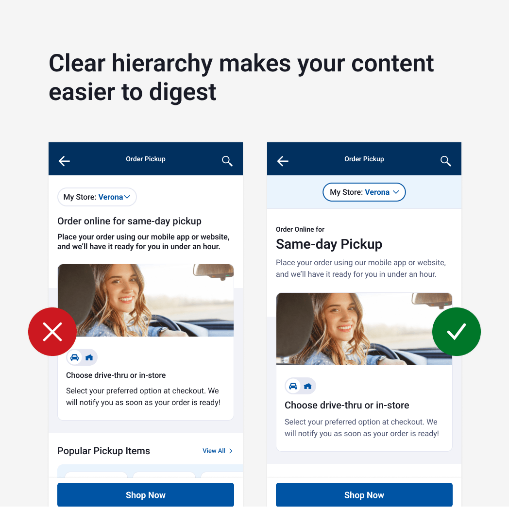
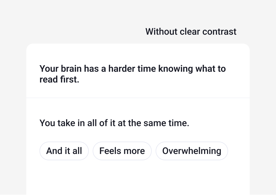
Common Mistake: Using heading styles that are too similar or overusing colors meant to add emphasis can make it difficult for your user to know what to read first.
Text styles, brand colors and button sizes should be distinct enough that they don’t compete with each other.
#2. Simplicity
How much information does your user have to process while trying to accomplish a task? Does it feel overwhelming?”
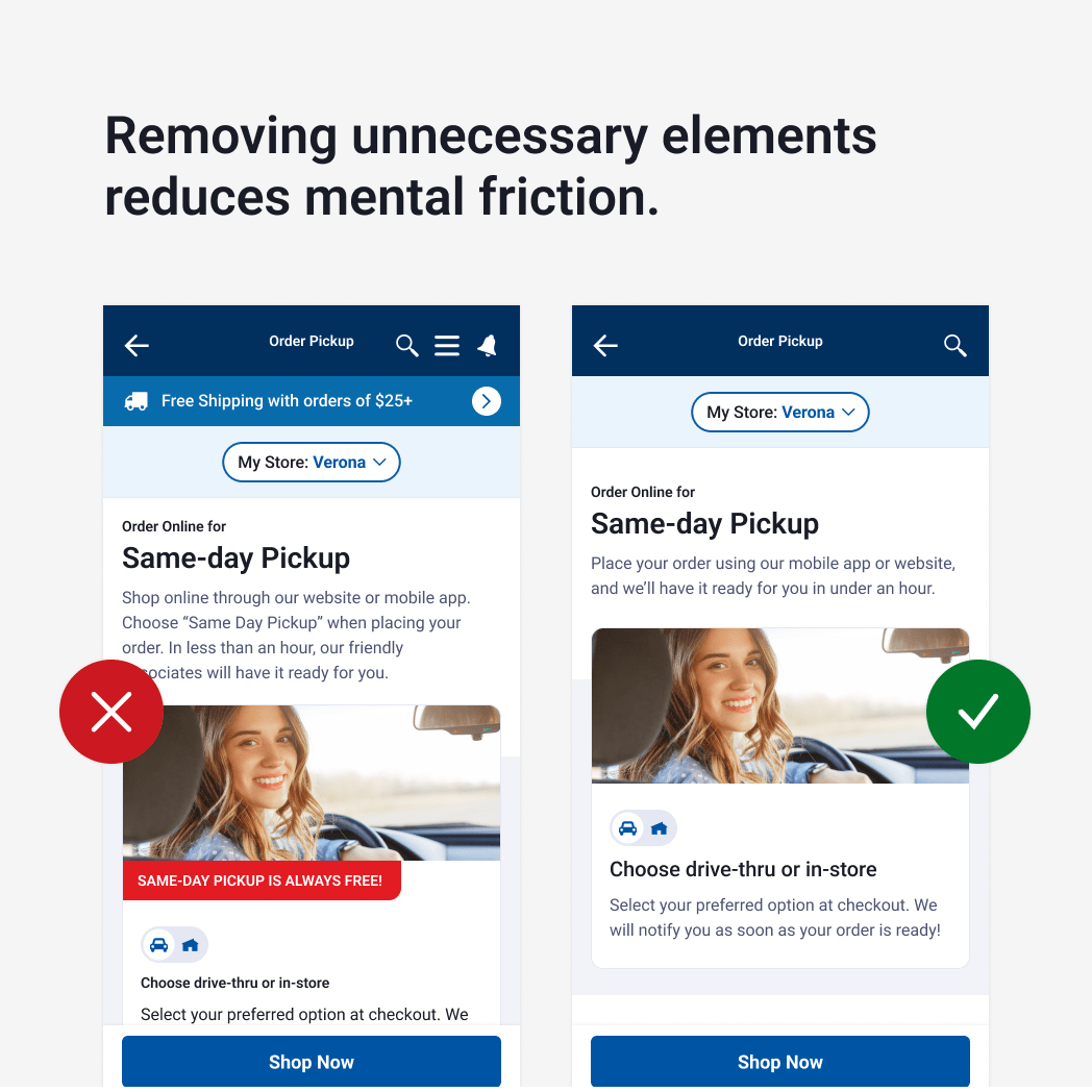
Reduce friction in your user experience by:
- Removing or hiding unnecessary items from a given screen if they aren’t relevant to the task at hand (e.g. banners, search bars, options that aren’t relevant to that specific user)
- Simplifying text as much as possible and using expandable sections for more detailed content
- Using space to group related elements, and splitting up content as needed. This allows the user to process it one bite sized chunk at a time.
- Giving your content enough breathing room—aka margins, padding and white space.
- Eliminating extra steps. Sometimes cutting out even just one extra click can have a huge impact.
- Avoiding visual clutter. Too many icons, fonts, borders, or colors can be distracting.
#3. Consistency
This is important in two contexts.
Your design should be consistent with user expectations, based on their experience with similar tools.
Make your product easier to use by leveraging patterns the user is already familiar with. For example, we typically expect underlined text to contain a link. Because of this, using underlined text in other contexts can create confusion.
Some elements have near universal meaning across any platform—like a gear icon to indicate settings—but others are more nuanced.
Knowing where to display a menu, a selector, or additional details depends on knowing where your user will look for them. This requires doing some research—what patterns exist in similar tools your user navigates regularly? Is this their first time using a product like yours?
Your design should be consistent within your own digital environment
Using elements consistently across your own content makes the experience both predictable and aesthetically pleasing.
This includes things like:
- Color
- Alignment
- Text styles
- Icons
- Proportions
- Language
- Borders
- Image treatments
- Illustration style
Creating a design system with standardized components for everything from buttons to grid layouts can hugely improve your UI by helping to create a cohesive experience.
But it ALSO:
- Speeds up development
- Simplifies your code
- Makes future changes to your product simple. Editing the style in one location reflects changes across your environment, everywhere that component is used.
#4. Function over aesthetics
We all like pretty things. But ten times out of ten, we’ll use an ugly app that gets the job done over a sleek one that doesn’t.
In my first project as a user experience designer, I was pushing to include minimalist third-party sign-in buttons displaying only a logo. I was excited about the way it decluttered the UI on the login screen, and I had seen other brands use the same format.
But our design lead reminded me that our user base skewed older; they might need more explicit textual context. While my original design would have been intuitive to most people, our user base was not most people.
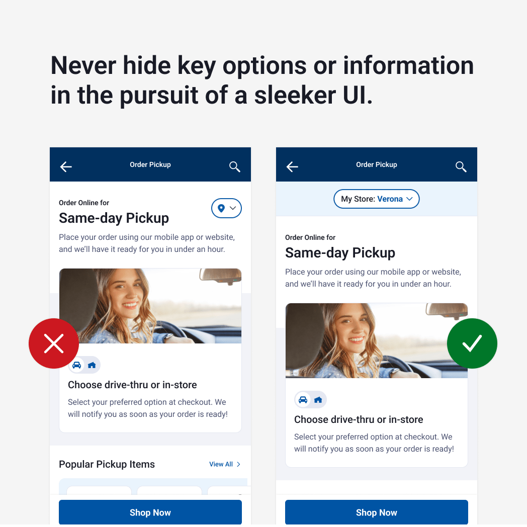
Common mistakes: Oversimplification at the expense of clarity
Removing or nesting unnecessary elements can be a great way to create more straightforward user experiences. But decisions about the content you display on each screen should be primarily based on your user’s needs, not your aesthetic priorities.
The needs of your users change with their context. And your #1 job is to understand them well enough to meet them where they’re at. For example—how tech savvy are your users? Will they be using your app while driving? While walking around a store? Factors like these will affect how you prioritize and break up content.
TL;DR
Great digital experiences feature simple, intuitive UI.
These four guidelines break that down in more concrete terms.
- Hierarchy helps your user determine which content is most important, guiding their eye down the screen, and enabling them to find what they need quickly.
- Simplicity reduces friction in your user experience by avoiding visual clutter, using space to group related elements, and splitting up content as needed. This allows the user to process information one bite sized chunk at a time.
- Consistency makes your product easier to use by leveraging familiar elements and patterns. Using consistent components in your design can also speed up development and streamline future edits.
- Function over aesthetics ensures that pretty UI never trumps ease of use for your users, taking into account their unique context and needs.